From Logotype to Prototype
May 29, 2016
What is the difference between lettering and type?
The difference between a logotype and a typeface is similar to the difference between lettering and type. Lettering is a context-specific set of letterforms designed to work in only one form and sequence and to form a particular word shape or phrase. Type is an industrial product. A mass-produced and mass-produceable set of components designed to work together and in combination in an endless variety of configurations.
A logotype is something that exists in contextual perpetuity. It consists of a set of shapes designed to work harmoniously together, and in the same pattern. Its requirement for legibility is at the level of the word, and so often liberties will be taken with the relationship between the forms, with some letters looping around others, creating ligatures, or similar letterforms conceived of with alternate structures to create interest and difference within the form of the word but importantly, without disrupting it. The letters in a logotype have a requirement to space well to their neighbors in this particular combination, and there is no requirement for these letters to function in a repeating system. This concern begins only with the separation of the parts of the whole into discrete modules for reuse and recombination for use in a typeface.
Typefaces are systems of shapes and behaviors of shapes—a sort of form language built out of smaller micro decisions. Each decision is woven into a pattern of behaviors for stroke endings, stem/bowl connections, weight distribution, angle of stress, counter size, proportions etc. to create the textura of the paragraph. Textura is the Latin word for fabric, and the name of the first types. It denotes the aim for consistency and evenness of color in typography that is built out of a carefully maintained relationship between the parts of the letterforms, and the spaces between them.
Scale, typographic range & context Starting from an uppercase: What information do we have, what do we need to move forward?
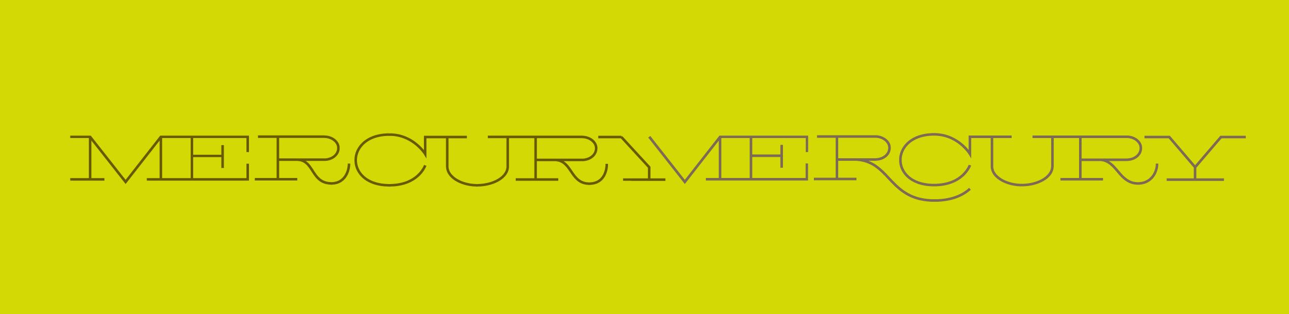
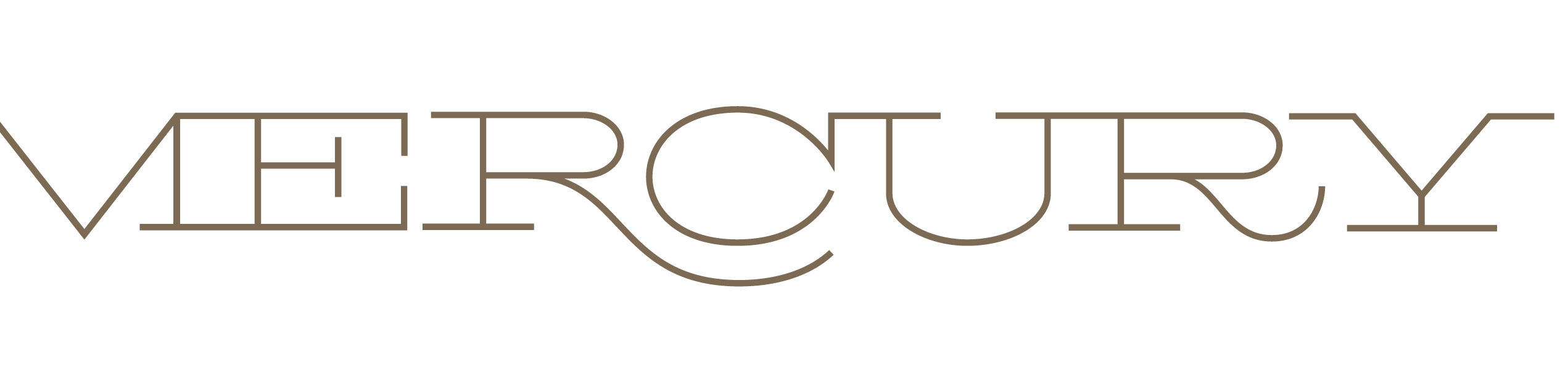
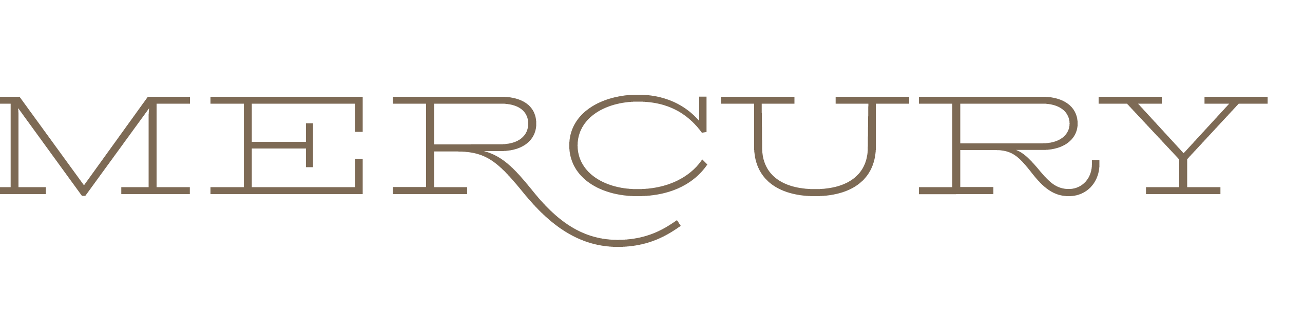
Taking MERCURY as the starting point, I decided to build out a lowercase. Because the starting point was a very light weight and very extended it fit squarely in the category of a display typeface. In typography there are three general levels of typographic context. Text, Display and Agate.
Text typefaces are designed for setting long-reading paragraph text, and are usually built in families that comprise weights and styles to help differentiate hierarchical content at the micro level of the paragraph for emphasis or differentiation to include italicization of titles, subheads and paragraph level headings. Usually typefaces designed for text will also work well at larger heading or titling sizes, but these can form their own distinct subgroup too.
Display typefaces are usually meant to be used at large sizes. They are usually but not always more expressive, or more detailed, either in their complexity or in the contrast and refinement of their details, for example, a very high contrast typeface with chunky thick parts and hairline delicate thins, or particularly fat faces where the counters are works of pure abstract art, and would never function for readability at smaller scales.
Typefaces designed for this scale tend to be more tightly spaced and kerned and more limited in their uses. It is usually possible to use a text typeface at a large size and have it be readable, even if not particularly successful, but it is rarely possible to use a display typeface at a smaller scale and have it be comfortable to read.
Agate typefaces are those typefaces designed for the level below paragraph setting, usually for things like phonebooks, captions, dictionaries or stock listings. A great example of an agate typeface is Bell Centennial, or a later and related model, Retina.
These typefaces tend to be more loosely spaced, with lower contrast, wider apertures and more disambiguation between similar letterforms for easy differentiation at smaller sizes. Features are often exaggerated at this size to ensure they will survive the print or screen conditions they will be fighting in conjunction with their minimal scale.
Dwiggin’s m-formula is a theory that has been used to great effect in typefaces of this ilk. Dwiggin’s formula explicated the idea that he garnered from marionette making, where he noticed that the facial features of the marionettes needed exaggeration from far away and that sharp angles underscoring curves would have the counterintuitive effect of amplifying their curved nature from a distance. He named this the m-formula for the marionettes that prompted it. It is on show in typefaces like Freight Micro, where the letterforms feel sharp and angular at larger sizes but at small sizes have a flow and softness and most importantly, a clarity to them that is created with this optical trick.
A fascinating and insightful resource looking into the history of designing typefaces for different scales and contexts is Tim Ahren’s Size-specific adjustments to Type Designs.
Starting with a logotype in this way also dictated the nature of the typeface that would be offsprung. The large, light capitals were not weighty enough or narrow enough for anything but display type, and so I set myself a task of building a primarily display typeface that might later develop into a family that might support longer-reading text setting at ample sizes.
By building Biorhyme Extended as a display typeface, I gave myself a little more room for expression and idiosyncrasy in the shapes, which I would later tone down in the narrower width.
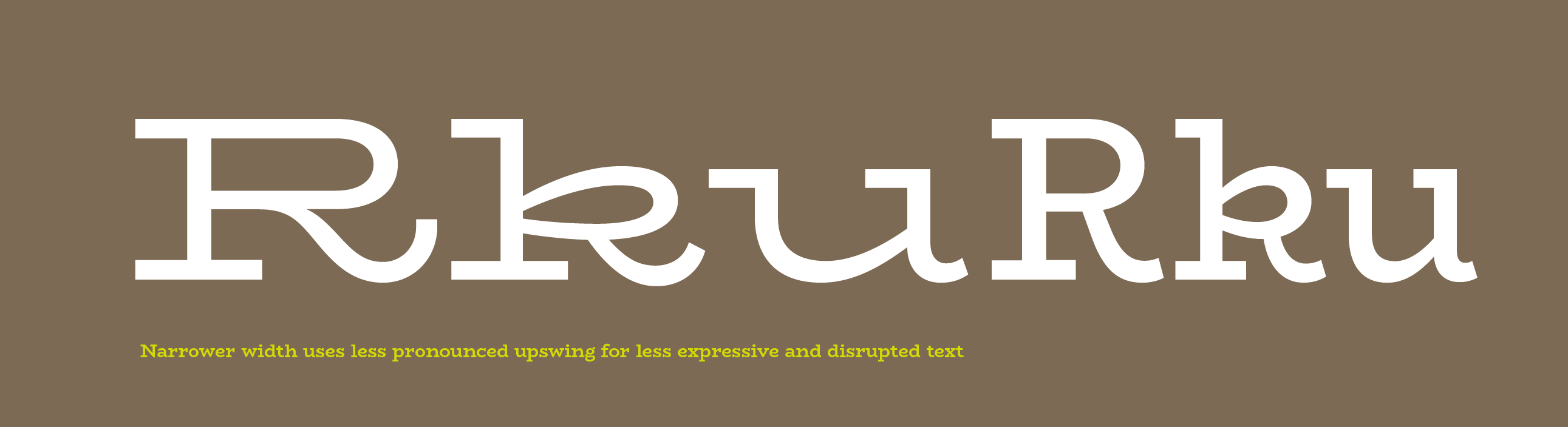
Because I wanted Biorhyme to feel fresh, I didn’t want to rely on a specific model for the development of the lowercase, and set myself the challenge of creating a matching lowercase based on the abstract cues found in the uppercase forms. In actual fact, there were few typefaces that fit the exact kind of look and feel I was aiming for, and so this also gave me a bit of free reign. Working in a very narrowly defined genre does create limits for the designer, as their work will be assessed with respect to other types in the same design space, and so they need to adhere to precedent a little more than in the design of something a little more off the beaten track.
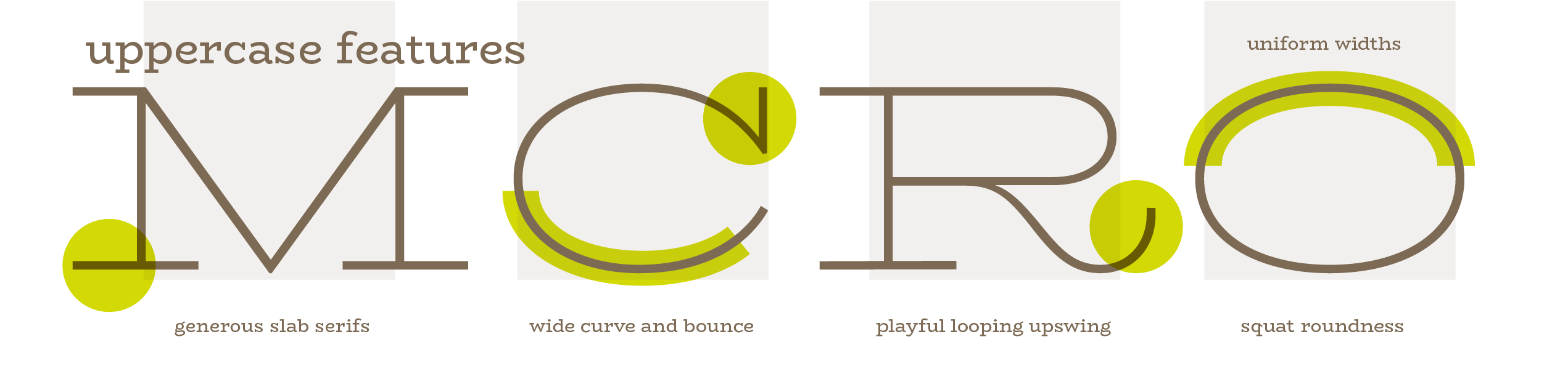
So, in order to build a description of the shape language I wanted to make, I looked at the slow generous bubbly curve of the C and the playful kick of the R and the similarity in widths that I had established between the uppercase letters, and decided to see where I could go with that.
Share