Family Planning
May 29, 2016
Defining a design space
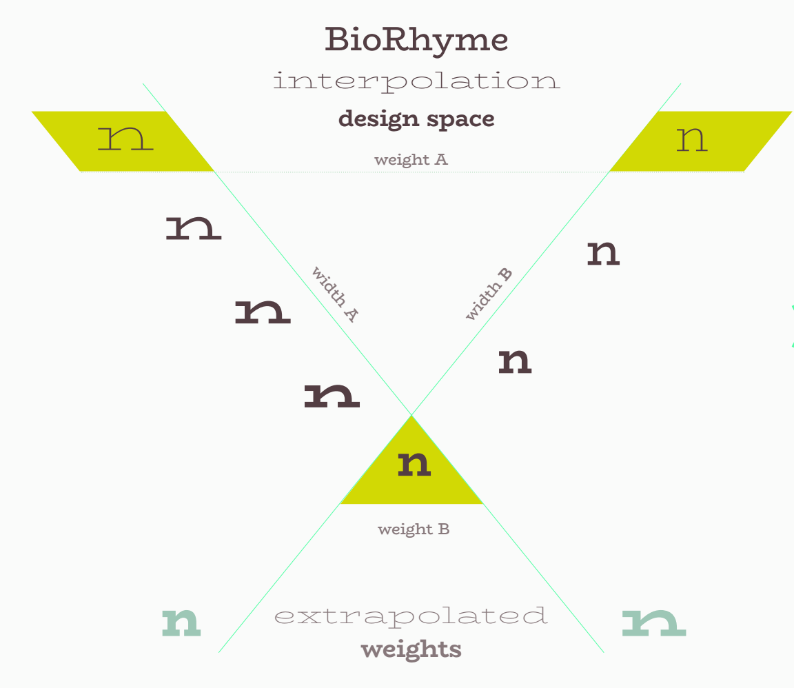
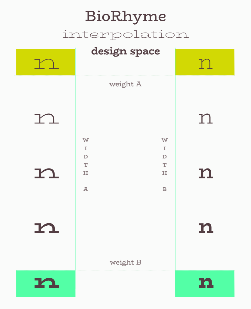
Having gotten the wide light master up and running, the next step was to develop the other masters. I decided to focus on developing a narrower width and a heavier weight and use these three masters to interpolate. My plan in doing these three masters had been to allow myself enough scope in the design project to document and discuss the factors that contribute to the development of a narrower weight, adding weight to a skeleton to create a bold and the use of interpolation as a design tool. The intention was to create three discrete masters, Wide Light, Regular-width Light, and Regular-width Bold, and from these interpolate a Regular-width text-setting Regular weight. You can see this original interpolation schema below.
The intention was always to expand the family to more weights than these four, but for efficiency, and under time pressure, I limited it to just these four to start off with. As I moved my way through the development of the three masters, I set up instances for other weights and widths, and did some tests to look at how an obliqued roman might function as the basis for a true italic later down the line. This helped me to figure out the role of the different weights and widths in the personality and behavior of the typeface, and also kept my drawing consistent across the masters.
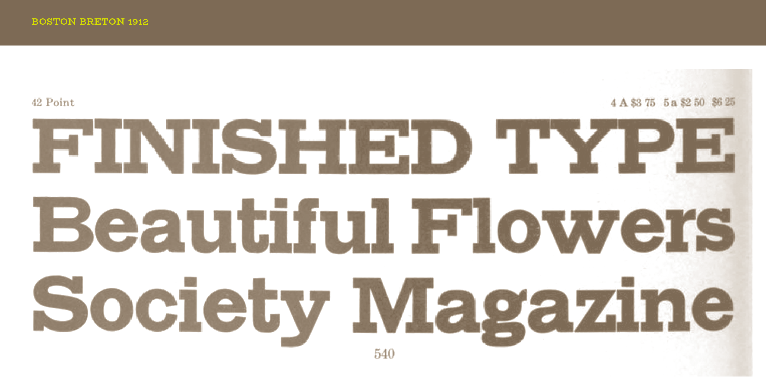
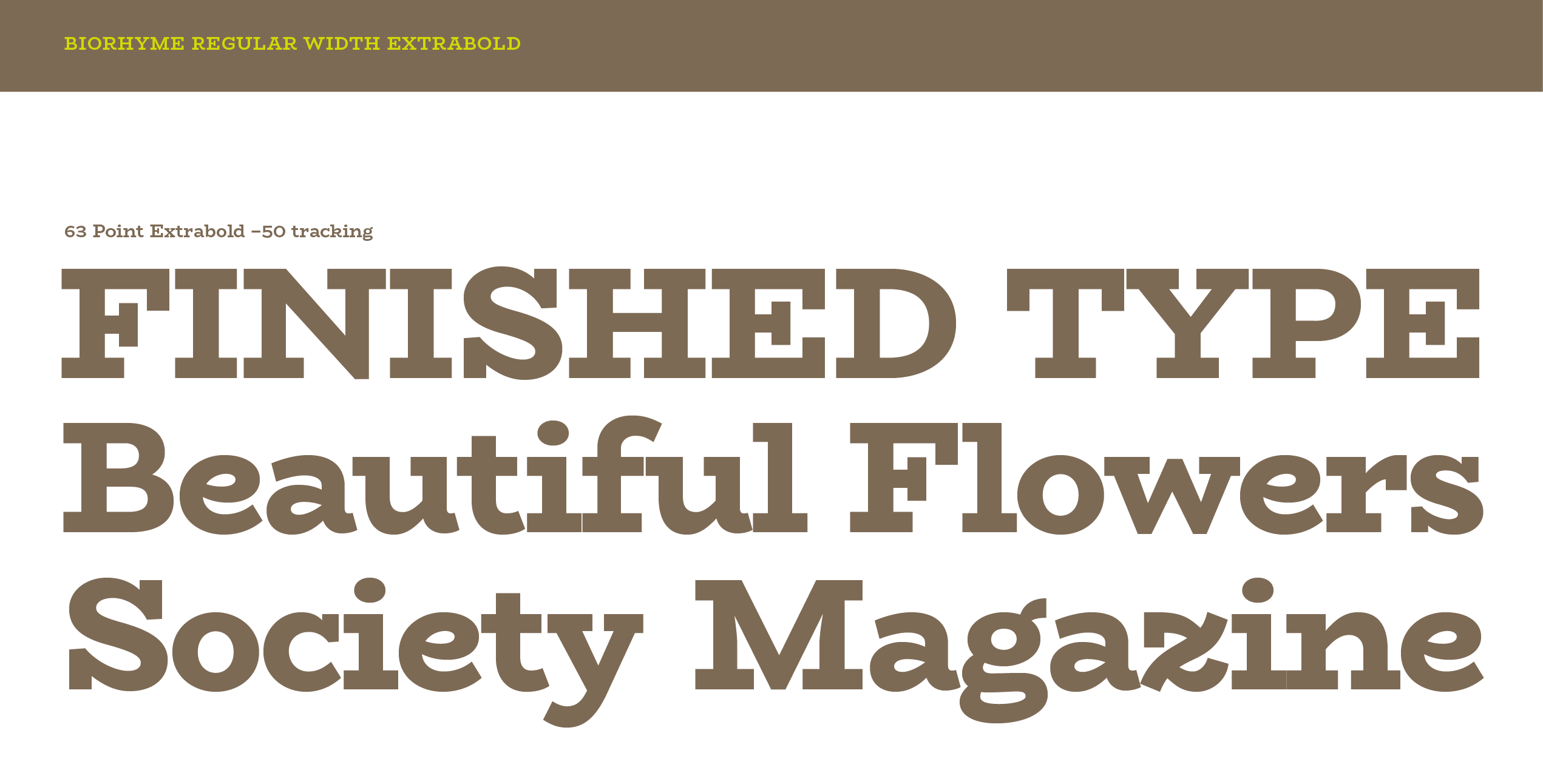
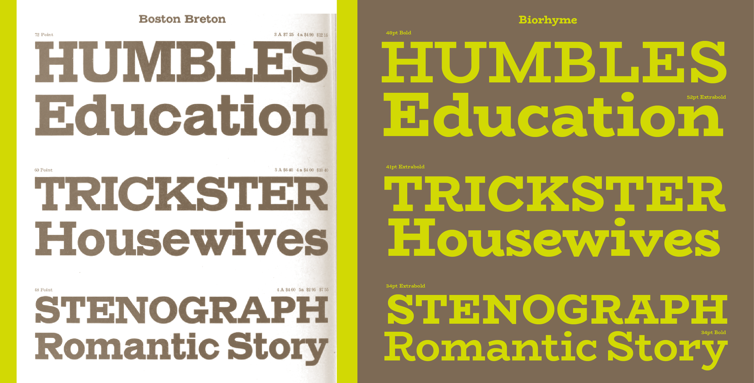
At the outset, however, I needed to make some coarse-grained decisions and outline the scope before starting. I decided to choose a reference point for the narrower width, this would help me to fill a gap in the GWF library, and also serve as a guide for some of the shape decisions. In this case, I chose a display typeface from the ATF catalogue ‘Boston Breton’ which had a similar mono-line slab serif quality to it, but was both much heavier and more mechanical feeling. I decided I wanted to evoke the bold chunkiness of Boston Breton and it’s proportions in the regular width bold, but using the soft tense curves and the typewriter vibe I had started in the wider width.
In developing this narrower Bold width, the narrower Light width and the interpolating regular weight/width, I looked to Clarendons, Archer, Century Schoolbook and in some cases Rockwell, for cues. I wanted it to sit in this category of warm slabby seriffed fonts, but have it’s own flavor that is both a combination of these all, and it’s own thing entirely. I hope I achieved it!
Share