Defining D.N.A.
May 29, 2016
Building a system out of a context-specific starting point
Although the decisions taken in the design of Biorhyme are specific to the shape-language it is defined by, most of the steps are generalisable to type design more broadly.
In the uppercase, global considerations that need establishing early in the process include making decisions about relative width (in respect of both uppercase cohesion as a set, as well as with regard to the lowercase proportions), height (in respect of the lowercase), crossbar optical heights, and weight. Conceiving of both the upper and the lowercase as a set of elements combining to make related forms is a reliable starting point.
There is a long history of building typefaces in this ‘elemental’ way. I have written about this here, and you can also read WA Dwiggin’s letter to RR, and investigate parametric and modular approaches to type design to note that this is a pervasive practice in typeface design projects. What this means is to construe of the letters as discrete shape elements and behaviors.
Beginning with this as a starting point, we can build the macro-structure of the typeface. Once you have established your widths, and rough proportions, you can begin to systematize the forms. Working with an upright stroke, a full height curve, a semi-height curve, full height diagonal stroke, and semi-height diagonal stroke you can rough out all the letterforms in the uppercase alphabet. Similarly, in the lowercase, you can break the letterforms down into an upright x-height stroke, an ascender height upright stroke, a descender height upright stroke, a bowl form, and an arch form.
These help you to establish the general movement, rhythm and contrast of the typefaces and once these general template elements are created, you can build rough drafts of the letterforms fairly quickly by working through a process of building groups of similar shapes together.
In researching approaches to the structure of syllabi for teaching typeface design, I saw this approach repeated in a few different ways, where the semester-long class is oriented around the letter groups themselves, and the learning stages structured around the optical adjustments and idiosyncrasies of the particular shapes in each group.
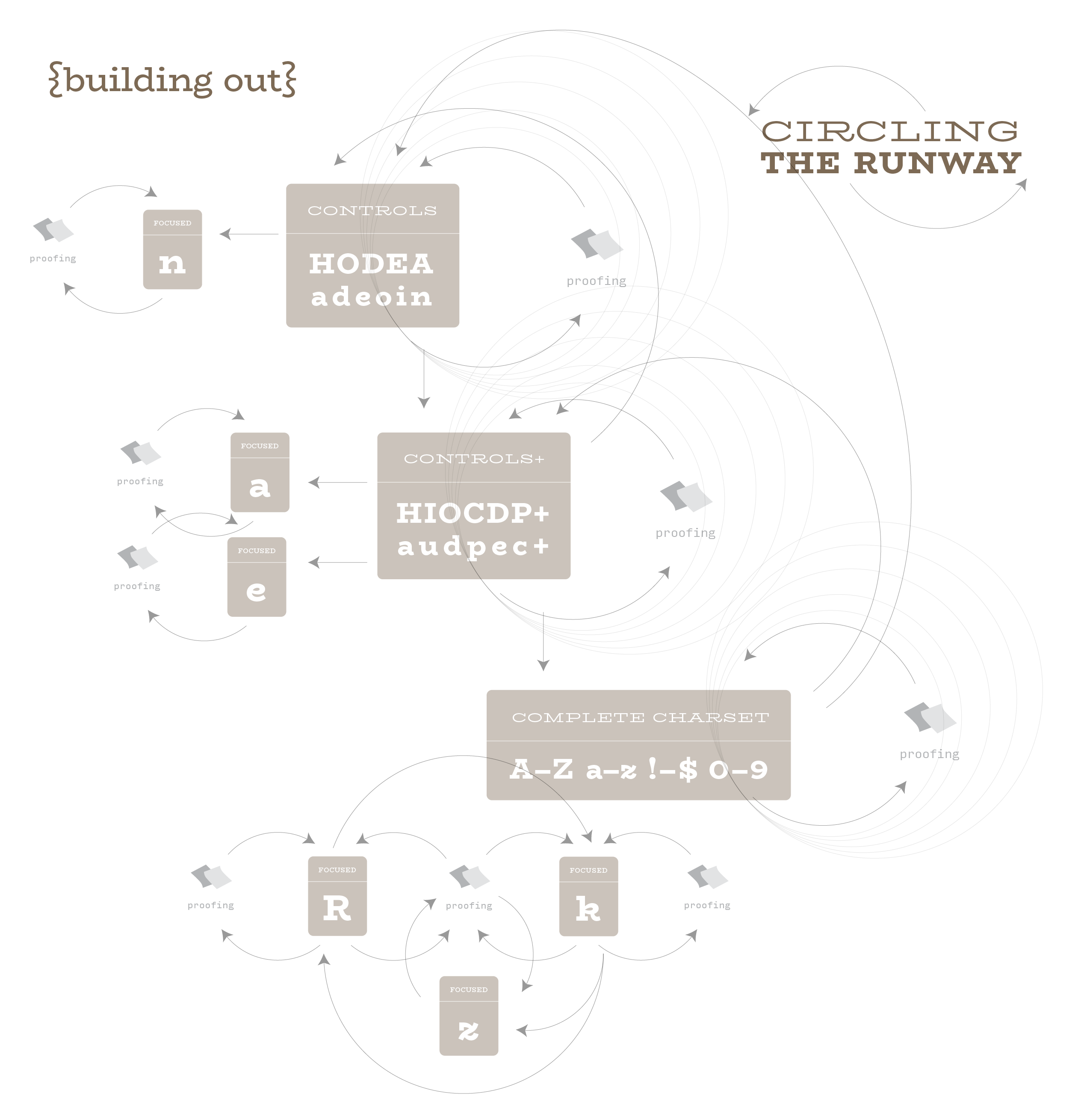
Because of the systematicity of typefaces, it is therefore possible to work on just a small test set of the letterforms in the upper and lowercase sets in order to get a pretty good picture of what the typeface will look like quite quickly. Different foundries have different starting points, but I like to use the letters HODBS for the uppercase, and the word adhesion for the lowercase.
Gerry Leonidas explains the origin of ‘adhesion’ here, and it is worth noting the tool Miguel Sousa developed for generating test copy for this limited character set. You can also see my old bosses talking about using the letters HOD as a starting point for the uppercase in this lovely documentary about the work of Hoefler & (at that time) Frere-Jones, and I would also refer you to the documentary Teaching to See for Druckrey’s take on this.
These limited sets provide a solid starting point, and allow a ‘quick-and-dirty’ prototype of your typeface. ‘Quick-and-dirty’, because no well-functioning typeface is complete without optical adjustments to these coarse grained component combinations. The eye needs regularity, and this method achieves that, but it also requires the additional disambiguation of the letters, or, in other words, the ability to discern differences in structure easily in order that the letters be quickly recognized.
Pure modularity will not afford much in the way of idiosyncrasy and differentiation for the eye, and so it is necessary to fine-tune these combinations to work as harmonious forms in their own right as well as in respect of the other letterforms.
Fine-tuning can affect the weight of the connections, for example in the lowercase a, the bowl here is smaller than that in the p, and simply scaling the bowl of the p will result in a much too narrow bowl, with too light a weight, and very thin connections. It is important to ensure that the entire typeface looks like it was made of the same material, or tool, and this is usually achieved through optical trickery. Tobias Frere-Jones’ blog has some great explanations of Type Mechanics along these lines. These fine-tuning aspects also run in tandem with the micro-aspects of the letterforms, things like the shapes of the terminals, serifs, and swashes.
It is also a good time to develop the shapes and scale of the punctuation, which again will vary depending on the context and scale of the typeface brief. Typefaces for smaller setting will usually need larger punctuation, counter-intuitively, than display typefaces, simply because they have to work harder to be seen at this size.
Punctuation can again be broken into categories or shape groups, and it is useful to think of the basic set in terms of points, slashes, dashes, and enclosures to start, and once the alphabet and this basic set are up and running the currency symbols and mathematical symbols can be developed alongside the numerals and fractions. One reason for this is that the numerals and currency symbols both need to work alongside the entirety of the upper- and lower-cases, and the mathematical characters are dependent on the numerals for their cohesion, one falls in line behind the other in this method, taking their cues from the previous set. Typefaces are systems of shapes and behaviors, and the process of type design is a similarly interrelated process full of dependencies and variables.